Website for Personal Trainer: Convert Clients in 2026
It's 10 PM, and you're still digging through Instagram DMs to find the prospect who asked about pricing yesterday. Your calendar is in one app, payments are somewhere else, and client notes live in a spreadsheet you only half trust. That setup works when you've got a handful of people. It breaks fast when your roster grows.
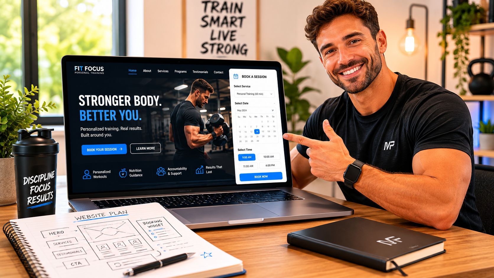
A proper website for personal trainer businesses fixes that. It gives referrals a clear next step, cuts admin, and makes you look organized before you ever get on a consult call. In a market estimated at $41.4 billion in 2023, with about 90,667 trainers competing for clients in the U.S., a professional website is no longer optional if you want to stand out and win business, according to Insurance Canopy's annual personal trainer data report.
Table of Contents
Stop Running Your Business from Your DMs
If your business runs through DMs, texts, notes apps, and a payment link you pasted three months ago, you don't have a system. You have a pile of conversations.
Clients notice that fast. They may like your content, but if they can't tell what you offer, what it costs, or how to book, they hesitate. Warm leads go cold in boring ways. They forget, get distracted, or book with the trainer who made the next step easier.
A website for personal trainer businesses should act like your front desk. It should answer the basic questions, show proof, and move someone from interest to action without you manually babysitting the process.
What your website should do for you
A useful website is not a digital flyer. It should handle the jobs that keep interrupting your day.
Pre-qualify leads: Explain who you help, how you coach, and what kind of client is a good fit.
Reduce repetitive messages: Put pricing structure, service options, and common questions in one place.
Create trust fast: Show certifications, client results, progress tracking, and a clear coaching process.
Push action: Give one obvious next step, usually book a consult or apply for coaching.
Practical rule: If a referral lands on your site and still has to DM you just to understand the offer, the site isn't doing its job.
There's another reason this matters. Referrals are warm, but warm traffic still needs direction. If your current setup feels messy, clean that up before you spend time tweaking colors or fonts. The foundation is the flow from visit to booking.
One of the better places to tighten that process is your onboarding. If you want a cleaner handoff from lead to active client, study what a strong client onboarding software setup for trainers looks like and then build your site around that path.
The Blueprint Before You Build Your Website
Most trainers build the site backwards. They pick a template, upload a few photos, write “online and in-person coaching,” and hope it works. That's the website version of writing a program before you know the client's goal.
Start with the strategy. Three decisions shape the whole site.
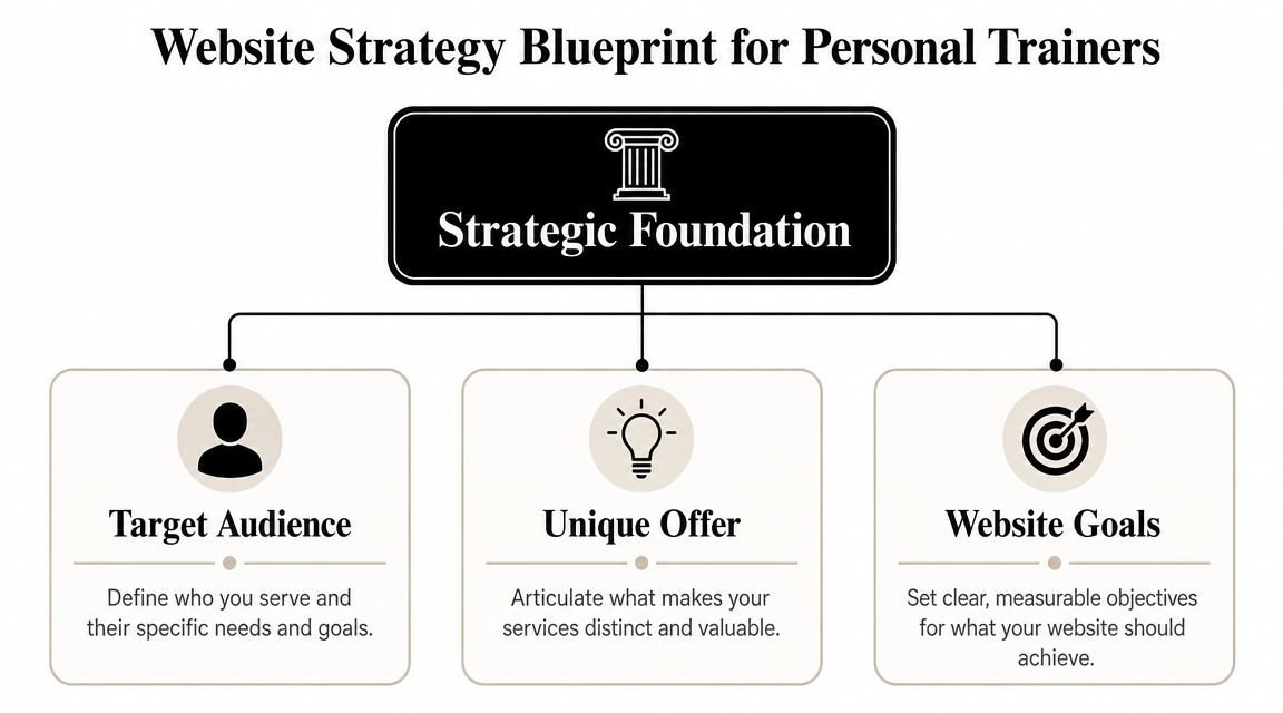
PT Pioneer reports that 36% of clients find trainers through referrals, and 74% of consumers say performance tracking is the most important software capability, based on its breakdown of consumer preferences for personal training. That tells you two things. First, your site has to convert warm traffic fast. Second, you need to show measurable outcomes, not just motivation and personality.
Pick one conversion goal
Don't ask your site to do five things equally well. Pick the one action that matters most.
For most solo trainers, the strongest primary goal is one of these:
Book a consult
Apply for coaching
Buy a starter package
If your roster depends on higher-ticket coaching, consults usually work best. If you already have strong referral traffic, a short application can help filter people before you get on a call. If you sell a fixed starter offer, direct checkout can work, but only if the offer is simple.
A weak website has multiple competing calls to action. “Book now,” “download my guide,” “join my newsletter,” and “follow me on Instagram” all fighting for attention. Pick one primary CTA and let everything else support it.
Define your client narrowly
“Busy professionals” is still too broad. “Women over 40” can still be too broad. A site starts converting when the visitor feels like you built it for them.
Good targeting sounds more like this:
A desk-bound father who wants strength back without living in the gym
A woman returning to training after pregnancy who wants structure and confidence
A runner who needs strength work to stay healthy and improve performance
A beginner who hates gym culture and wants private guidance
The narrower you get, the easier it becomes to write headlines, package services, and choose proof that matches the right person.
The best websites don't sound bigger. They sound more specific.
If you need to sharpen your positioning before you touch the site, reviewing the practical requirements for becoming and working as a personal trainer can help you clarify what credentials, coaching style, and service promise matter to your ideal client.
Write the one sentence that sells you
Your value proposition should answer this in plain English: why should this person hire you instead of the other trainer they were just looking at?
A strong version usually includes:
Who you help
What result you help them pursue
How your coaching approach is different
Examples of the structure:
I help busy professionals build strength with realistic training that fits around work and family.
I coach beginners who feel intimidated by gyms and need a clear plan, accountability, and simple progress tracking.
I help runners build strength and resilience so they can train consistently without feeling beat up.
That sentence becomes the spine of your homepage, service page, and social bios. If you can't say it clearly in one sentence, the rest of the site will wander.
Essential Pages and Copy That Actually Converts
Most trainer websites don't fail because they're ugly. They fail because the copy is vague. They look fine, but they sound like every other trainer in town.
Successful trainer websites are highly specific about audience and coaching philosophy, and generic sites often fail because they feel interchangeable, according to Vibe Otter's analysis of trainer website best practices.
Homepage
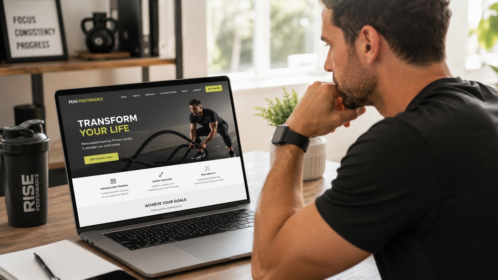
Your homepage has one job. Tell the right person they're in the right place, then show them what to do next.
Must-have elements
Clear headline: Say who you help and what problem you solve.
Short subheadline: Explain your method in normal language.
Primary CTA: One button only. Book a consult, apply, or start here.
Proof near the top: Testimonials, results, certifications, or progress examples.
Simple service snapshot: Give a quick overview of your offers without forcing people to dig.
Copy pro-tip
Write the headline around the client's problem, not your job title. “Strength coaching for runners who want to stay healthy and perform better” is stronger than “Certified personal trainer and online coach.”
Services page
This page should sell the structure and outcome of your coaching, not just list session lengths and hourly rates.
What to include
Service categories: In-person, online, hybrid, small group, or specialty coaching
What's included: Programming, check-ins, progress tracking, session frequency, messaging support
Who it's for: Spell out the right fit for each offer
Next step: Every package should lead to the same action
A lot of trainers bury the value by leading with price. If your offer is premium, package the coaching first. Explain the experience. Then explain how to start.
About page
This page is not your autobiography. It's where your story proves you understand the client's problem and have a method for solving it.
Keep these on the page
Your coaching philosophy: How you train and why
Relevant credentials: Certifications, experience, and specialties
Why clients trust you: Your process, standards, and communication style
A human detail or two: Enough personality to feel real, not enough to ramble
Clients don't need your full life story. They need a reason to believe you understand where they are and can guide them forward.
A good About page connects your experience to their outcome. If you came from chronic inconsistency, injury, burnout, or your own body composition struggle, tie that back to how you coach now.
If you've still got print materials floating around that say one thing while your website says another, fix that mismatch. Your brand should feel consistent across every touchpoint, including your fitness trainer business cards.
Contact and booking page
Even well-designed websites shed clients. Too much friction kills action.
Non-negotiables
Short form: Name, email, goal, and one qualifying question is enough
Booking option: Let people schedule without back-and-forth
Expected response time: Set clear expectations
Location and format: In-person, online, or hybrid
One fallback method: Email or phone, not six options
If your booking page asks for a full training history, nutrition habits, injuries, goals, and preferred schedule before they've even spoken to you, it's too much. Save the deep intake for after they commit.
Integrate Your Business Tech Without the Headaches
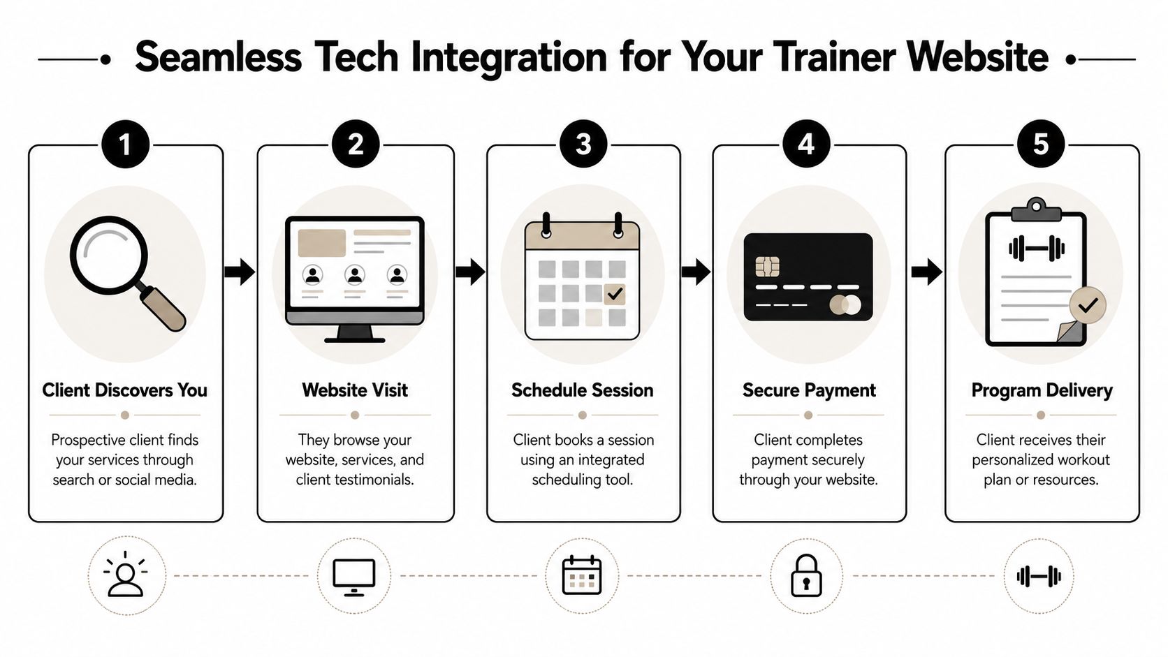
A lot of websites look polished until a prospect tries to become a client. Then the cracks show.
They click “book now” and land on a separate calendar tool. They pay through another link. Then you manually create a profile somewhere else, send forms by email, and hope nothing gets missed. That setup feels patched together because it is.
The pressure on this side of the business is only increasing. The global online fitness market was valued at about $15.5 billion in 2023 and is projected to grow at more than 32% CAGR through 2032, according to My PT Hub's roundup of personal trainer statistics and trends. As clients expect remote and hybrid coaching to feel normal, your website needs to function like a working business system.
What a smooth client flow looks like
Here's the standard worth aiming for:
Step | What the client should experience | What you should avoid |
|---|---|---|
Discovery | Clean landing page with a specific offer | Generic homepage with no obvious next step |
Booking | Embedded scheduling or a direct booking path | Back-and-forth DMs to find a time |
Payment | Simple checkout for consults or packages | Manual invoices after the fact |
Intake | One form tied to the booking or purchase | Separate email chains and duplicate data entry |
Delivery | Immediate next steps and organized client access | Sending links and files one by one |
The point isn't fancy tech. The point is reducing handoffs. Every extra step creates drop-off, admin, or confusion.
This walkthrough gives a good visual of how a cleaner front-end flow should feel in practice:
What to connect first
If your stack is messy, don't rebuild everything at once. Fix the highest-friction parts first.
Scheduling: Clients should be able to request or book a consult without messaging you first.
Payments: Connect one payment flow for starter offers, consult fees, or recurring coaching.
Intake: Keep forms short at the top of the funnel. Gather full details later.
Client handoff: Once someone books or pays, they should immediately know what happens next.
Coach's shortcut: The best setup is the one that removes repeated admin from your week, not the one with the most features.
Be careful with software that looks good on day one but creates headaches later. Trainers have been burned by rising prices, buggy apps, and products that changed direction after acquisition. Reliability matters more than novelty when your income depends on renewals and retained clients.
If recurring coaching is part of your model, this is the first backend process I'd tighten. A straightforward recurring payment setup for personal trainers saves hours of follow-up and removes a lot of awkward payment chasing.
Get Found by Local and Niche Clients with Basic SEO
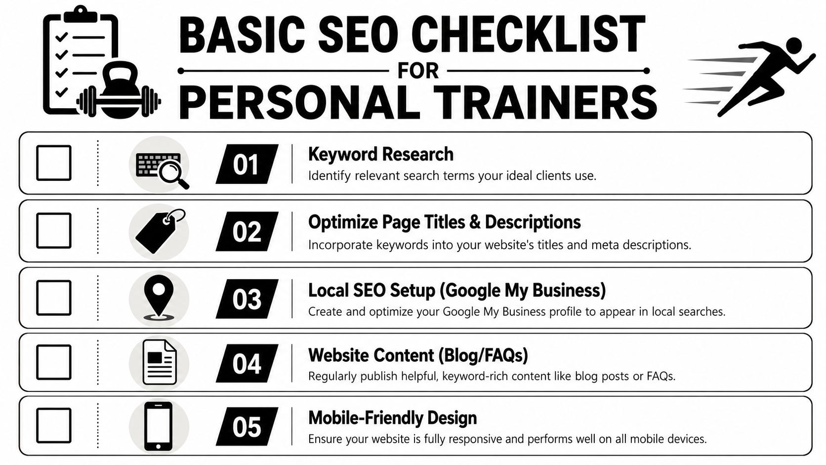
You don't need to become an SEO specialist to get more out of your site. You need to make it obvious what you do, who you help, and where you work.
Google uses mobile-first indexing, and trainer website guidance keeps stressing fast load times, tap-friendly buttons, and simple forms because prospects check trainers on their phones, as outlined in Durable's guide to personal training website examples.
Local search basics
If you train in person, local SEO matters more than broad traffic.
Use this checklist:
Put your service and location in page titles: “Personal Trainer in Denver” is better than “Home.”
Match your homepage headline to real searches: Include your service, niche, and city naturally.
Create a Google Business Profile: Add services, photos, business description, and correct contact details.
Collect reviews: Ask current clients for honest feedback that mentions your coaching style or specialty.
Keep your contact details consistent: Your website and business profile should match.
Your local pages should sound like a real person wrote them. Don't stuff city names everywhere. One solid page for your main area is better than a pile of thin pages trying to rank for every suburb.
Niche search basics
Niche traffic is often better than broad local traffic because the intent is clearer. Someone searching for “strength coach for runners” or “postpartum fitness coach” already knows what kind of help they want.
A few practical moves:
Create one page per specialty. If you coach runners and busy dads, those should not live on the same generic service page.
Write specific FAQs. Answer the exact objections or concerns that niche client has.
Publish useful articles. Short pieces that solve real client questions can support those pages over time.
Get relevant mentions. Local businesses, podcasts, and community organizations can send stronger trust signals than random directories.
Mobile fixes that matter
Most trainers lose leads on mobile because they make action too hard.
Check these basics on your phone, not just your laptop:
Buttons should be easy to tap
Forms should be short
Text should be readable without zooming
Your main CTA should appear early
Booking should work in under a minute
If your homepage opens with a giant image, a vague slogan, and no visible action, mobile users will bounce fast.
For coaches building out their digital home base, it helps to think beyond one website page and look at the whole personal training home setup for client acquisition and retention. That wider view usually exposes where leads are dropping out.
Your Website Launch and Maintenance Checklist
A website isn't finished when it goes live. It's finished when it consistently helps you book the right clients and saves you time every week.
That means launch clean, then maintain it like you maintain a program. Review it, adjust it, and keep the core lifts moving.
Launch week checklist
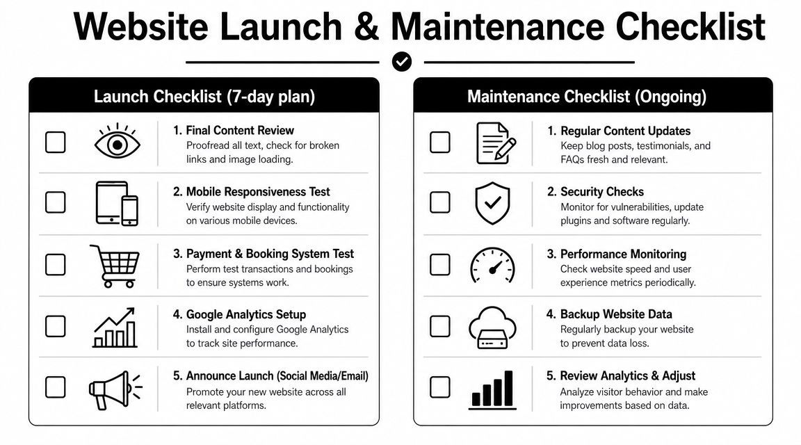
Here's a practical 7-day push to get the site live without overthinking it.
Day 1
Read every page out loud: You'll catch awkward copy and missing words faster.
Check every CTA: Every button should go somewhere useful.
Trim filler: If a sentence doesn't help trust or action, cut it.
Day 2
Test on your phone: iPhone and Android if possible.
Run the whole booking flow: Submit the form, book the consult, test the confirmation.
Check load feel: If pages feel slow or clunky, simplify images and sections.
Day 3
Review service pages: Make sure each offer is clear and distinct.
Tighten your About page: Less autobiography, more relevance.
Update proof: Add recent testimonials, progress photos, or client stories with permission.
Day 4
Set up analytics: You need visibility into what pages people visit and where they drop off.
Connect your Google Business Profile: Make sure the website link and contact info are correct.
Check indexability basics: Titles, descriptions, and headings should match the page topic.
Day 5
Send it to two trusted people: Ask them one question, “Can you tell what I offer and how to start in under a minute?”
Watch where they hesitate: That's usually the core problem.
Fix confusion before design details
Day 6
Add the website to your Instagram bio
Put it in your email signature
Update your messaging templates so new leads go to the right page
Day 7
Announce it to your audience: Keep the message simple.
Invite current clients to share it
Start sending every referral there instead of explaining your offer from scratch
Launch at version one. A live site with a clear offer beats a half-finished perfect site every time.
Monthly and quarterly maintenance
The website for personal trainer businesses that keeps working is usually the one that gets light, consistent attention.
Monthly tasks
Refresh proof: Add one fresh testimonial or recent client win
Check forms and booking links: Broken forms cost real leads
Review mobile experience: Small issues creep in after updates
Update schedule or service details: Keep the front end aligned with how you coach
Quarterly tasks
Write one useful article: Answer a real question clients ask all the time
Review your homepage headline: Does it still match your best-fit client?
Audit your images and testimonials: Replace anything outdated
Look at analytics: Find the pages people visit most and improve their CTA
A site goes stale without fanfare. Old offers stay up. Testimonials stop feeling current. The booking page still works, but the process feels clunky. None of that looks dramatic, but it chips away at trust and conversions.
If you do one thing this week, fix the path from homepage to booked consult. Not your logo. Not your fonts. The path.
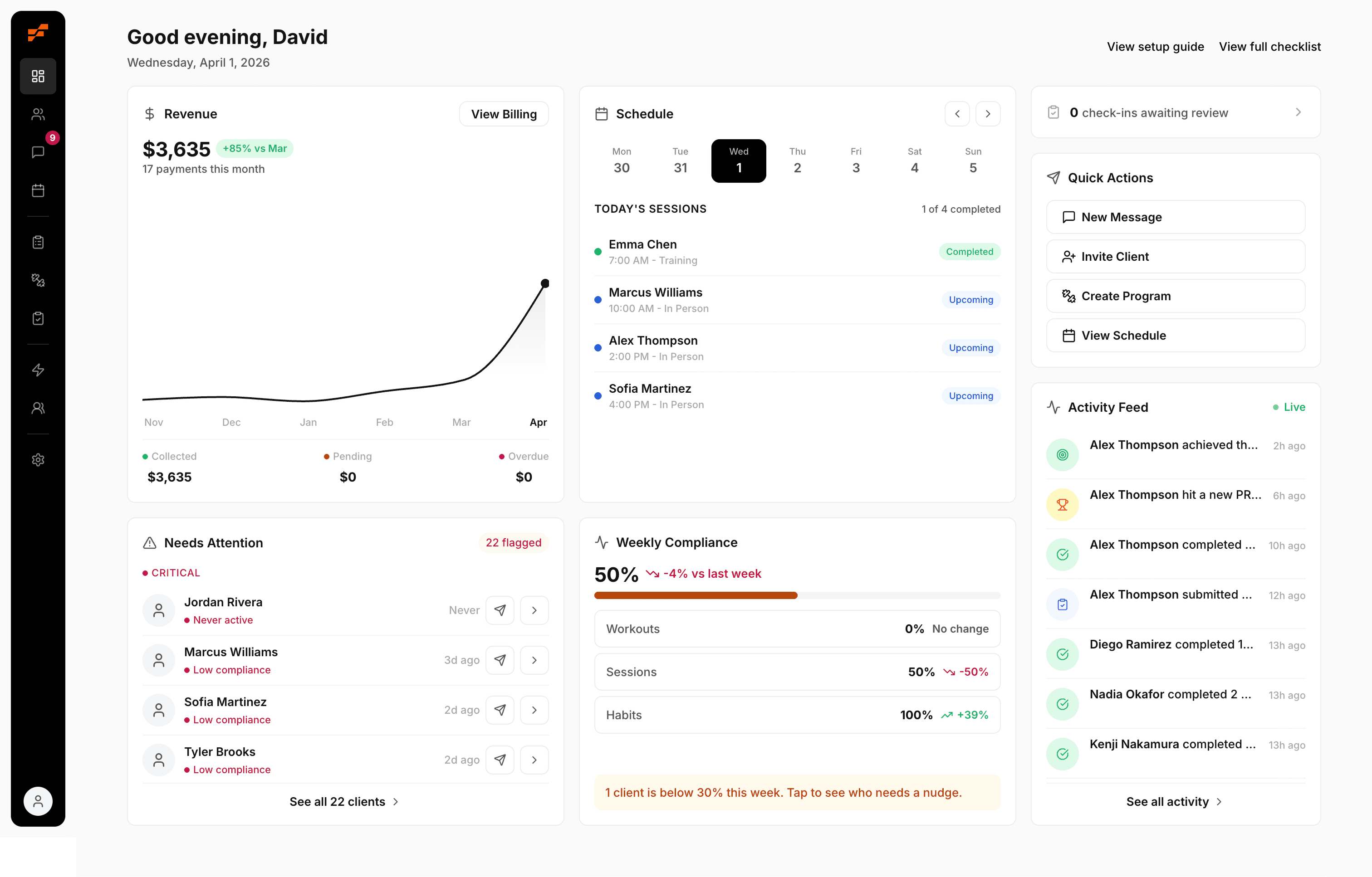
If your website is ready to do more than collect inquiries, FitCentral gives you the trainer-first backend to match it. You can manage scheduling, payments, messaging, progress tracking, programming, and client profiles in one reliable system built by a practicing trainer, David Spitdowski, who uses it with real clients every day. Start by mapping your current client journey, then compare it against the workflow you actually want. That gap is the next thing to fix.
See also



Ready to stop fighting your software?
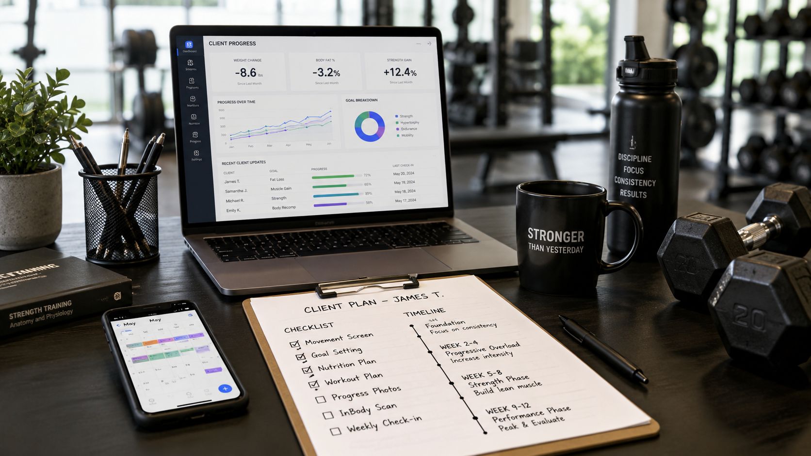
FitCentral gives you everything you need to manage clients, deliver results, and grow your business. Sign up today.