Fitness Trainer Business Cards That Get You Clients

You meet someone who is a perfect-fit client. Good conversation, real interest, clear pain point. Then the moment comes to follow up, and you either dig for your phone, tell them to search your Instagram later, or hand over a card that says little more than your name and “Personal Trainer.”
That’s where most fitness trainer business cards fail. They act like mini brochures when they should act like conversion tools. In a high-intent setting, an effective handout approach can produce 1 lead for every 5 to 10 cards and a response within 48 to 72 hours, while passive handouts see a 70% discard rate and less than 5% response according to PT Direct’s business card marketing guidance.
If you coach your own roster, your card shouldn’t just help people remember you. It should help them take the next step.
Table of Contents
The Anatomy of a High-Converting Trainer Card
The five elements that actually matter
What strong card copy looks like
Design and Material Choices That Signal Quality
What the format forces you to get right
Materials that feel professional without wasting budget
Design choices that make a card feel expensive
Match the card to the client you want
Using QR Codes to Bridge a Physical Card to Your Digital World
Where your QR code should send people
Why this matters more for hybrid coaches
Print Specifications and a Pre-Order Checklist
The print terms worth knowing
Your pre-order checklist
Effective Distribution Strategies for Fitness Trainers
The handoff that gets used
Three distribution plays that hold up in the real world
Your 24-Hour Action Plan
The Anatomy of a High-Converting Trainer Card
A trainer card has very little room, which is why every line has to pull its weight. If a prospect looks at it for three seconds, they should know who you help, why you’re credible, and what to do next.
The five elements that actually matter
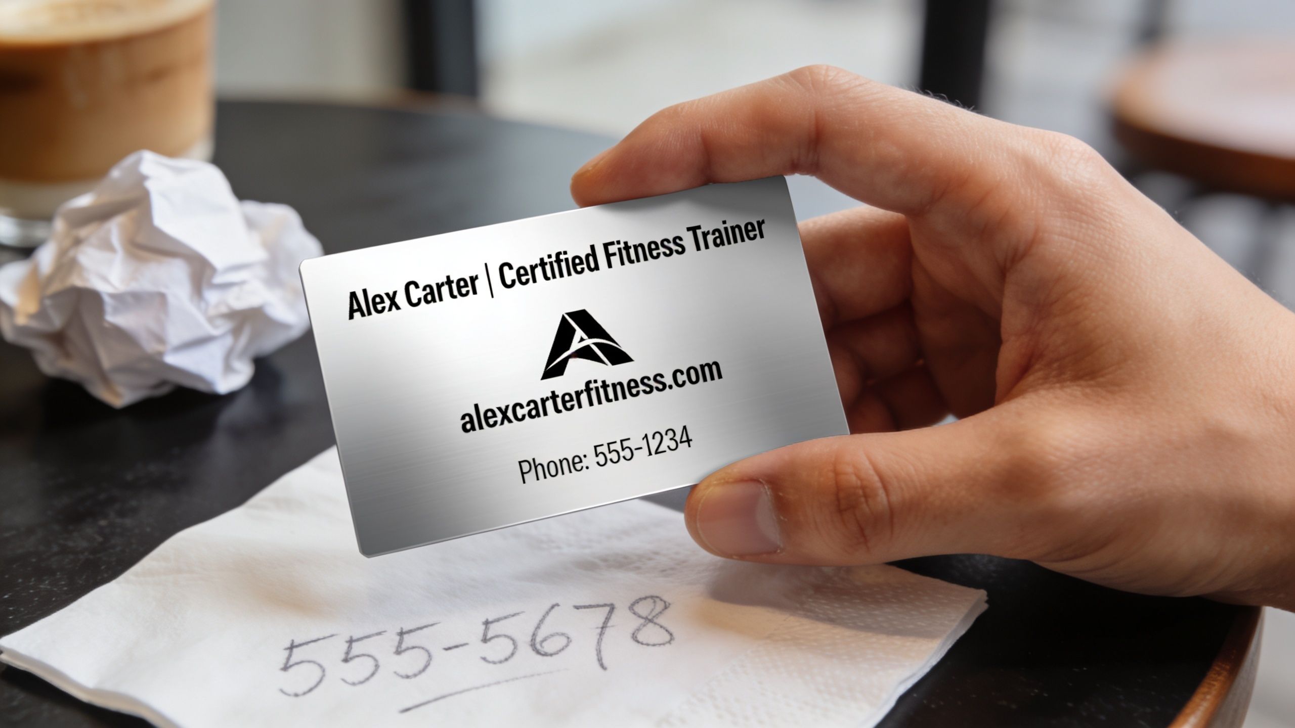
Your name and credentials
Lead with your name, then the credential that matters most to your buyer. Keep it tight. One or two relevant certifications are enough.A specific niche
“Personal Trainer” is too broad. It tells people your job title, not your value.
Better examples:Postpartum Strength Coach
Weight Loss Specialist
Strength Coach for Busy Professionals
Sports Performance Coach for Youth Athletes
One direct contact path
Pick the method you respond to. If you hate email, don’t feature email. If your phone is your fastest route to consults, use that.A clear call to action
Give them one next move. Not three.
Good CTAs:Book a free technique session
Scan to apply for coaching
Claim your movement screen
Book your consult
A website or professional profile
This is your proof layer. If someone isn’t ready to book, they’ll still check you out.
Practical rule: If a line on your card doesn’t help someone contact you, qualify themselves, or take action, cut it.
A lot of coaches waste space on slogans that sound polished but say nothing. “Transform your life” doesn’t filter. “Strength coaching for women returning to training after pregnancy” does.
What strong card copy looks like
Here’s a clean structure that works:
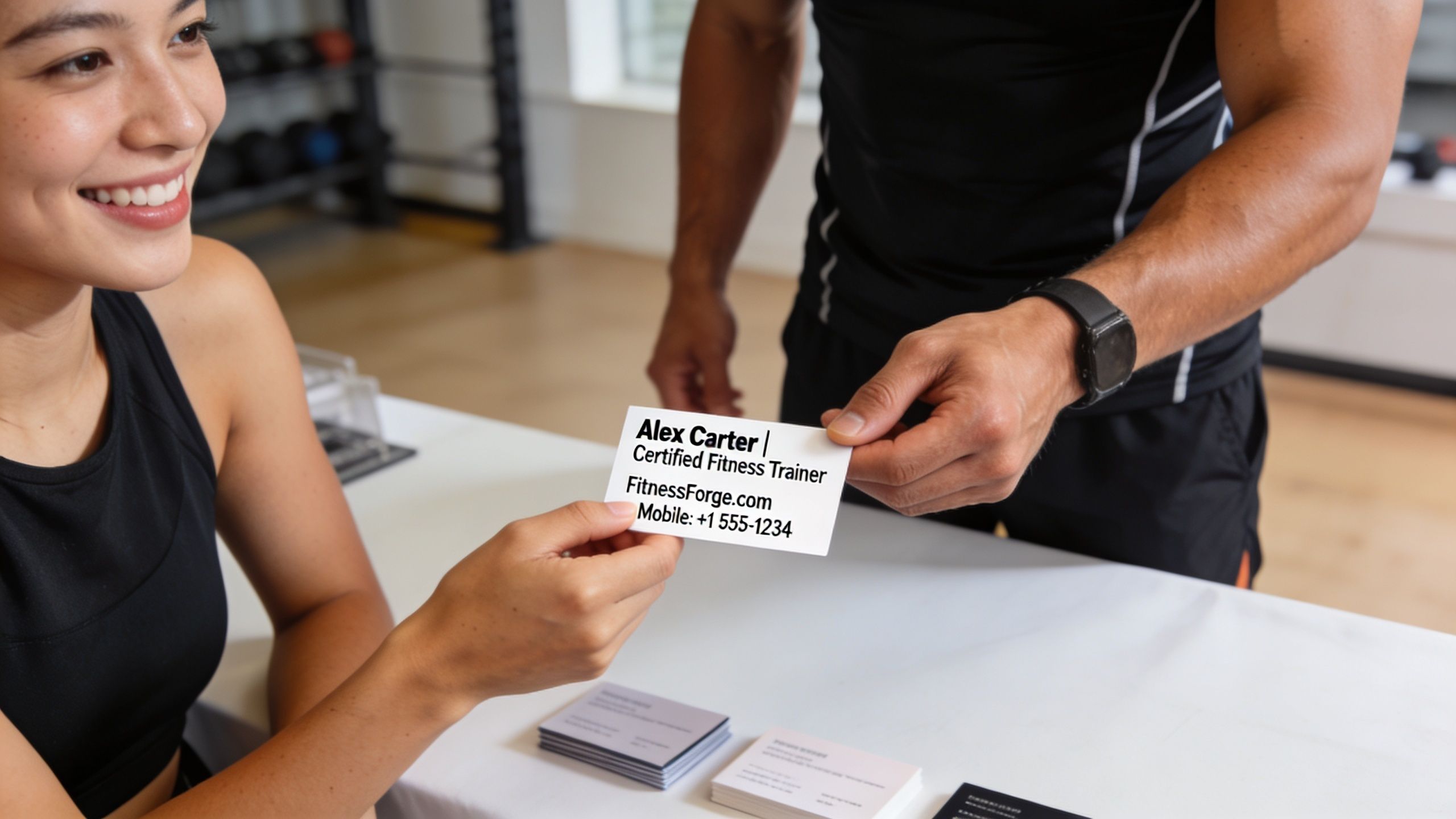
Element | Example |
|---|---|
Name | Alex Carter |
Credentials | NASM-CPT |
Niche | Postpartum Strength Coach |
Contact | |
CTA | Scan to book your free movement screen |
The best copy does two jobs at once. It attracts the right people and repels poor-fit leads. That’s a good thing. A card that appeals to everyone usually brings you the wrong inquiries.
A few niche examples:
For fat loss coaching
“Jordan Lee, NASM-CPT”
“Weight Loss Coach for Busy Parents”
“Book your free technique fix”For performance coaching
“Sam Rivera, CSCS”
“Strength and Speed Coach for Field Athletes”
“Apply for 1:1 coaching”For online habit-based coaching
“Taylor Brooks”
“Nutrition and Habit Coach for Remote Clients”
“Scan to start your coaching application”
Keep the wording concrete. Keep it readable. Keep it easy to remember. If you want a stronger digital destination behind the card, your public-facing workflow should be as clean as your message. That’s why a polished coaching presence matters, whether that lives on your site or through a client-facing setup like FitCentral.
Design and Material Choices That Signal Quality
A prospect leaves your group class, slips your card into a pocket, and finds it again that night. In that moment, the card is doing sales work. If it feels cheap, crowded, or forgettable, the lead cools off before they ever scan or book. If it feels clear and well judged, it buys you a little more trust and a much better shot at the next step.
What the format forces you to get right
Standard trainer cards are small. That constraint helps.
A 3.5 by 2 inch card leaves no room for weak choices. Every extra line fights your offer. Every decorative element competes with the action you want the prospect to take. Good cards use that limitation well. They guide the eye fast, make the offer easy to understand, and push one next step.
That is why I rarely recommend exotic layouts first. Square cards, folded cards, plastic cards, and die-cut shapes can stand out, but they also cost more, fit wallets poorly, and sometimes get thrown out faster because they feel gimmicky. A standard size with strong hierarchy usually wins on real-world use.
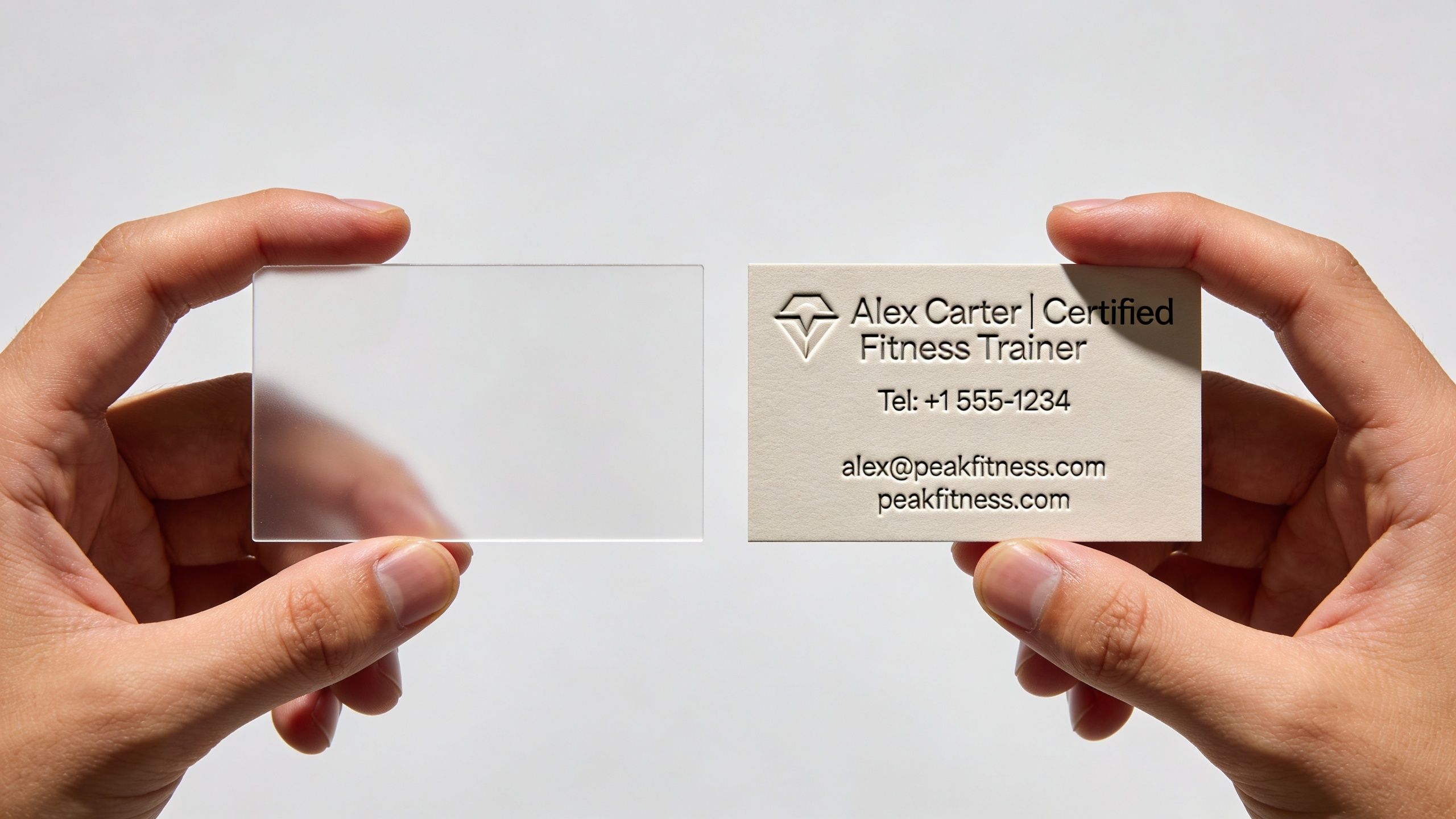
Materials that feel professional without wasting budget
Paper stock matters because people judge coaching quality with shortcuts. They have not trained with you yet, so they judge the signals in front of them.
A flimsy card sends the wrong signal. So does a card loaded with expensive finishes that add cost but no function.
For most trainers, a thicker stock with a matte or soft-touch finish is the safest bet. Matte is easier to read under gym lighting, fingerprints show less, and the card usually feels more controlled in hand. Gloss can work if the design is minimal and image-heavy, but on a busy card it often reflects overhead lights and makes the details harder to read.
My usual recommendation looks like this:
14 pt to 16 pt stock for a solid feel without getting bulky
Matte or soft-touch finish for readability and a cleaner impression
Rounded corners only if they match your brand and do not distract from the CTA
One premium detail at most, such as spot UV on a logo, if your pricing and audience support it
One premium choice is enough. More than that usually turns a lead-generation tool into a vanity item.
Design choices that make a card feel expensive
Cheap-looking cards usually fail in predictable ways. The coach tries to fit in every service, every platform, every credential, and every visual idea. The result feels uncertain.
Strong cards feel deliberate because they follow a few rules:
Use plenty of empty space so the key message and CTA stand out
Pick readable fonts that still look clean at small sizes
Limit the color palette to your established brand colors
Keep image use restrained unless photography is a central part of your brand
Create one focal point so the eye lands on the right action fast
The goal is not to look fancy. The goal is to look clear, capable, and consistent with the service you sell.
There is a real trade-off here. Minimal design can look premium, but if you strip away too much, the card becomes generic. On the other side, bold branding can be memorable, but if it overpowers the call to action, response drops. The right balance depends on your niche. A postpartum coach, a strength coach for athletes, and a luxury in-home trainer should not all use the same visual tone.
Match the card to the client you want
Design should filter. It should not just impress.
A card for high-ticket, appointment-only coaching should feel more selective and polished. A card for general-population gym leads can be a little more direct and energetic. A youth sports performance coach can get away with sharper contrast and more edge. A mobility or corrective exercise specialist usually does better with a calmer layout and more breathing room.
That consistency matters beyond print. If the card promises a polished coaching experience, your site, booking page, and brand story need to back it up. A useful reference point is FitCentral's company overview, especially if you are tightening the connection between your offline materials and your client-facing presence.
A good card does not win because the paper is fancy. It wins because the design makes the next action feel easy and the trainer behind it feel worth contacting.
Using QR Codes to Bridge a Physical Card to Your Digital World
A modern card shouldn’t end the conversation. It should move the conversation somewhere better.
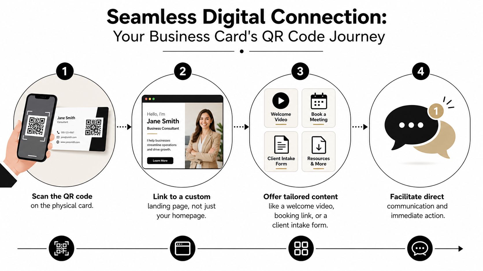
The QR code is the most important part of fitness trainer business cards for coaches who don’t want leads dying in the gap between “sounds good” and “I’ll look you up later.”
Where your QR code should send people
The homepage is usually the wrong destination. It creates extra decisions. A better card sends people to one action.
Three strong options:
A direct booking page
Best for in-person consults, technique sessions, and intro calls.
This works because it captures motivated people while interest is fresh.A specific free resource
Good for coaches who need one more touch before the sale.
Think a mobility guide, warm-up checklist, or nutrition starter resource tied to your niche.A coaching application form
Best if you sell higher-touch coaching and need to pre-qualify.
This can save time if your roster is already full of referrals and strong-fit leads.
A dynamic QR code is worth using because you can change the destination later without reprinting your cards. That matters when you update your offer, switch booking systems, or test a different follow-up page.
Don’t make the card ask people to do admin. Make it remove admin.
Why this matters more for hybrid coaches
For hybrid and online trainers, QR codes are essential. 60% of solo trainers scaling beyond 20 clients are now hybrid, and using a card with a client-specific QR for a habit tracking preview or direct booking link can boost retention by up to 28% while outperforming traditional cards by 15% in digital engagement metrics, according to Origym’s analysis of personal trainer business cards.
That matters because hybrid coaching lives or dies on friction. If someone has to search your name, find the right page, guess where to book, and wait for a reply, you’ve created too many exit points.
A stronger setup looks like this:
Met at a gym or event
Card handed over with one clear verbal prompt
Prospect scans immediately
Landing page matches the exact promise on the card
Booking, application, or resource is one tap away
If you coach remotely, skip the physical address unless you want people showing up there. Use the space for a stronger CTA or a short qualifier instead.
A card becomes far more effective when the physical handoff and the digital follow-up are designed together. That’s the difference between “nice card” and “new consult booked.”
Print Specifications and a Pre-Order Checklist
Good card design gets ruined at print stage all the time. Text sits too close to the edge. Colors shift. Logos look soft. The print file exports as the wrong format, and now you’ve paid for a box of cards you don’t want to hand out.
The print terms worth knowing
A few print basics save a lot of frustration:
Bleed means background color or imagery extends past the trim edge so you don’t get white slivers after cutting.
Trim line is where the printer intends to cut the card.
Safe area is the zone where your text and logo should stay so nothing important gets clipped.
If you remember one thing, remember this. Keep important text comfortably inside the edge. Printers are accurate, but cutting always has a tolerance.
For file quality, send a print-ready PDF if your printer supports it. Don’t rely on a random screenshot or a low-quality JPG exported in a rush. Use 300 DPI artwork so type and logos print cleanly.
Your pre-order checklist
Run this list before you place the order:
Check the copy
Confirm your name, credentials, niche, contact method, and CTA are all correct.Test the QR code
Scan it on multiple phones. Make sure it opens fast and lands on the right page.Review spacing
Move any text that feels close to the edge further inward.Export the right file
Use the printer’s preferred format, usually a print-ready PDF.Confirm image quality
Any logo or graphic should be high resolution, not dragged from a social profile.Order a small batch first if you’re unsure
A proof or short run is cheaper than a full reprint.Check the finish against your use case
Matte usually writes on better. Gloss can pop more visually.
If you’re building cards around consult booking, it also helps to check whether your current coaching software makes that handoff easy or clunky. Transparent tools matter when you’re deciding what workflow to put behind the card, and FitCentral pricing is a useful example of what straightforward software should look like.
Effective Distribution Strategies for Fitness Trainers
A prospect finishes a set, rubs their knee, and looks frustrated. You give one useful cue, they feel the difference on the next rep, and now your card has a job to do.
That is the standard. A trainer card should enter the conversation after value has been delivered, not sit in a pile at the front desk waiting to be ignored. Cards work best as handoff tools. They connect a real moment, a clear problem, and one next action.
A card left on a counter asks the prospect to create their own reason to care. That rarely happens. A card tied to a specific issue, tight hips in the squat, shoulder pain on pressing, low energy after work, gives the person a reason to scan now, not later.
The handoff that gets used
On a gym floor, the strongest play is a quick technique fix.
Spot an issue you can address in a sentence or two. Ask permission to help. Give one correction they can feel immediately. Then hand over the card as the follow-up path.
Use language like this:
“Your squat is shifting to the right, and that usually keeps showing up as knee irritation. I do a free movement check for that. Scan the code and book a short session. I’ll show you how to clean it up.”
That works because the card is attached to a live problem. You are not handing out contact details. You are prescribing a next step.
Earlier in the article, I referenced response patterns that favor active handoffs over passive distribution. The practical lesson matters more than the exact number. Cards get used when the prospect remembers the conversation and knows exactly what happens next.
Three distribution plays that hold up in the real world
1. Gym floor conversations
Best for trainers working in commercial gyms, private studios, and shared training spaces. Timing matters. Do not interrupt a hard set or force advice on someone who did not ask for help. Step in when there is an opening, give one useful fix, and use the card to move the person into your booking flow.
2. Client-led referrals
Happy clients can distribute cards better than you can, but only if you give them a specific use case. “Pass this to anyone” is lazy and usually wasted. “Give this to the coworker who keeps complaining about back pain from sitting all day” is better because the card lands with context.
3. Local partner touchpoints
Physio clinics, massage therapists, youth sports programs, apartment gyms, coffee shops near offices, and neighborhood events can all work. Match the card to the audience. A generic personal training card disappears fast. A card offering a runners’ mobility screen or a post-rehab strength consult has a reason to stay in someone’s wallet.
Distribution always comes down to fit. I have seen trainers print beautiful cards, then waste the whole batch because the message was broad and the handoff was weak.
A few rules keep the card working like a lead tool instead of a throwaway:
Lead with a real observation
Mention the problem you saw or the goal they stated.Give the card one job
Book a consult, claim an assessment, or start an application. Do not split attention across multiple actions.Ask for the action in the moment
If the conversation is warm, say, “Scan it now and save your spot.”Track where your best leads come from
Note the setting, the offer on the card, and whether the lead booked, showed up, and bought.
The follow-up system matters just as much as the handoff. If the QR code sends people to a slow page, a vague homepage, or a form you forget to answer, the card did its part and your backend failed. Good trainers treat the card and the follow-up as one system.
For more practical coaching and lead-generation ideas, the FitCentral blog for personal trainers and coaches is worth bookmarking.
Your 24-Hour Action Plan
Don’t spend the next week debating fonts. Write the copy first and build from there.
In the next 24 hours, do this:
Draft your five lines
Name, credential, niche, contact method, CTA.Pick your QR destination
Choose one. Booking page, free resource, or application form.Sketch a front and back layout
Keep it clean and leave more empty space than feels natural.Test two print vendors
Compare their templates, proofing process, and finish options.Scan-test your card flow
Make sure the page behind the QR code is fast, clear, and action-focused.
Avoid three expensive mistakes:
Cluttered copy that tries to say everything.
A residential address on cards for online or hybrid coaching when it adds no value.
No specific CTA, which leaves the prospect with nothing to do.
Your next move is simple. Open a document and write the exact words that belong on the card. If you can’t make the message clear there, design won’t save it. If you want a cleaner system behind the card once leads start coming in, contact FitCentral and see how other coaches are simplifying booking, client management, and follow-up.
FitCentral helps personal trainers and fitness coaches turn interest into action with reliable booking, scheduling, messaging, habit tracking, payments, and client management in one polished workflow. It was co-founded by David Spitdowski, a practicing personal trainer who still coaches real clients, so the product reflects the problems coaches deal with. If your current setup feels stitched together, buggy, or overpriced, take a look at FitCentral.
See also


Ready to stop fighting your software?
FitCentral gives you everything you need to manage clients, deliver results, and grow your business. Sign up today.