Website For Personal Trainers: Coach More, Manage Less

You know the feeling. A lead DMs you on Instagram, asks about pricing, disappears for two days, comes back ready to start, then asks for your availability. You send a booking link from one tool, an intake form from another, and a payment request from your phone. Meanwhile an existing client texts to reschedule, another forgot their invoice, and you're digging through email to find the last check-in photo.
That's not a marketing problem. It's an operations problem.
A good website for personal trainers should stop that mess. It should guide prospects into the right offer, collect the admin details you need, get them booked, get you paid, and give current clients one place to stay engaged. If your site only looks nice, but still leaves you managing your business through DMs, spreadsheets, and payment reminders, it's not doing its job.
Table of Contents
Your Website Is Not a Brochure It Is Your Operations Hub
Most solo coaches don't need more apps. They need fewer handoffs.
If a prospect has to message you for pricing, wait for a reply, then ask how to start, your website is creating work instead of removing it. The same thing happens when current clients bounce between text, notes apps, payment links, shared drives, and whatever form builder you set up six months ago and forgot to update.

What the broken setup looks like
Here's the pattern I see all the time:
Lead capture lives in DMs: people ask the same questions over and over because the site doesn't answer them.
Booking lives somewhere else: your calendar tool isn't connected to the rest of the client flow.
Payments are manual: you notice late invoices only when you go looking for them.
Client updates are scattered: progress photos, measurements, habits, and check-ins sit in different places.
You become the glue: every next step depends on you sending another link.
That setup works when you've got a handful of clients and a lot of patience. It breaks fast when your roster gets busy.
The industry isn't getting simpler either. The personal training field is large enough now that your digital presence has to do real work. IBISWorld's U.S. personal trainer industry outlook estimates 329,000 U.S. personal trainer businesses in 2025 and $11.9 billion in revenue by the end of 2025, while the Bureau of Labor Statistics outlook for fitness trainers and instructors projects 12% employment growth from 2024 to 2034. More coaches means more competition, and more competition means prospects expect cleaner systems.
Practical rule: if a client has to ask, “What do I do next?” your website is underbuilt.
What a real operations hub does
A website for personal trainers should handle two jobs at once.
First, it should help a prospect decide whether you're the right coach. Second, it should move them into your workflow without creating extra admin for you.
That means your site should connect:
Website job | What it should do |
|---|---|
Clarify the offer | Show who you help, what you coach, and how to start |
Reduce friction | Let people book without back-and-forth messages |
Collect key info | Intake before the first session, not after |
Support delivery | Give current clients a place for updates, reminders, and progress |
Protect your time | Cut down repetitive questions and manual follow-up |
If you want a useful example of how trainers can think beyond a homepage, this guide on building a stronger personal training home base is worth a look.
A brochure site says, “Contact me.” An operations hub says, “Here's the right service, here's proof, here's the next step, and here's where the relationship lives after payment.”
Plan Your Client Journey Before You Build Anything
Most bad trainer websites start with colors, templates, and photos. Good ones start with the path.
Before you pick a layout, map what should happen from first visit to first paid session. If that path is fuzzy in your head, it will be confusing on the page.
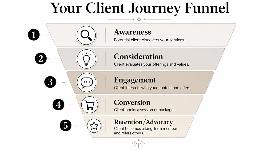
A practical setup is simple. PushPress notes that a strong website for personal trainers should follow a single conversion path: visitor -> service page -> proof -> booking. For coaches managing 5 to 50 clients, the usual sweet spot is a short homepage, one page per core offer, and booking tied to real calendar availability. The benchmark is clarity. Every page should reduce the number of decisions required before booking.
Start with three answers
Write these down before you touch your website builder.
Who do you help?
Not “men and women who want results.” That says nothing. Pick the client you coach well, such as postnatal moms, busy executives, gen pop fat loss clients, or lifters returning after injury clearance.What result do you help them pursue?
Use the language clients already use. Better energy, visible fat loss, stronger lifts, consistency, better habits, confidence in the gym. Keep it concrete.What is the single next step?
Application, consult, trial session, assessment, or direct booking. Pick one. If you offer five next steps, people stall.
Map the journey on one page
Don't overcomplicate this. A notebook page is enough.
Use this sequence:
Arrival: where they first land, usually your homepage or service page
Orientation: what tells them they're in the right place
Proof: what shows your coaching works
Decision: the offer and the price or starting structure
Action: booking, application, or payment
Onboarding: intake form, welcome message, next instructions
Most trainers don't lose leads because their coaching is weak. They lose them because the next step is unclear or delayed.
If you want to tighten the handoff after someone says yes, this article on choosing better client onboarding software can help you think through the backend.
What to remove before you build
This matters as much as what you include.
A lot of trainer websites fail because they force the visitor to sort through too many options. That usually shows up as cluttered navigation, overlapping packages, or generic copy that doesn't speak to any one buyer.
Cut these first:
Too many offers: if online coaching, in-person training, small group coaching, nutrition coaching, and one-off programming are all equal on the page, people hesitate.
Biography overload: credentials matter, but your life story doesn't belong at the top of the funnel.
Mixed calls to action: “book now,” “contact me,” “download this,” and “follow me” all on the same screen creates drift.
Hard-to-compare packages: if a visitor can't tell the difference between your offers quickly, they postpone the decision.
Build around one main route
For most solo coaches, one clear route beats clever design.
A clean journey often looks like this:
Stage | What the visitor needs |
|---|---|
Homepage | Clear problem, clear audience, clear next step |
Service page | What's included, who it's for, how it works |
Proof section | Results, testimonials, credentials, process |
Booking page | Calendar, intake, payment, confirmation |
That's it. No fancy funnel language needed. Just fewer decisions and fewer dead ends.
The Only 4 Pages Your Trainer Website Really Needs
You do not need a huge site. You need a useful one.
Most personal trainers waste time building pages nobody reads. The better move is to make four pages pull their weight. If each one does a specific job, your site will feel cleaner to prospects and easier to manage for you.

1. Homepage
Your homepage has one job. It needs to tell the right person they're in the right place, fast.
Must include:
A direct headline: say who you help and what you help them do.
A visible call to action: consult, apply, or book.
A short summary of your offers: enough to guide, not overwhelm.
Trust signals: results, certifications, client wins, or media if relevant.
A mobile-friendly layout: because initial client interactions often occur on mobile devices first.
Avoid:
Vague slogans: “Become your best self” doesn't separate you from anyone.
Autoplay hype videos: they slow the page and usually distract from the next step.
Long welcome paragraphs: nobody needs your full philosophy before they know what you offer.
A lot of coaches also hide the basics. Don't. Make it obvious whether you coach online, in person, or both. If you're still sharpening the professional side of your business, this piece on personal trainer requirements is a solid refresher.
2. Services page
This page should remove sales calls that only exist because your site is vague.
List your core offers clearly. Explain who each offer is for, what's included, how support works, and what the starting step is. You don't need bloated package names or clever labels.
If a lead has to message you just to understand what you sell, the services page failed.
A strong services page usually works best when each offer has:
A clear fit statement
A simple delivery model
What the client gets
What happens after they say yes
Here's a useful rule. If two packages feel almost the same, merge them or make the difference sharper.
3. About or results page
Call it About if you want. Build it like a proof page.
People care about your background, but only in the context of whether they trust you to help them. That means this page should focus less on your childhood sports story and more on evidence, process, and coaching style.
Use:
Short bio copy
Relevant credentials
Client testimonials
Before and after examples if you have permission
A simple explanation of how you coach
After you've drafted the page, watch this for a quick reality check on whether your site is helping or hurting trust:
4. Booking page
This page should feel boring in the best way. No friction, no surprises, no extra browsing.
Keep it tight:
Include | Why it matters |
|---|---|
Calendar availability | Stops the email ping-pong |
Service selection | Keeps people from booking the wrong thing |
Short intake form | Collects what you need before the first session |
Payment step | Confirms commitment and removes chasing |
Confirmation message | Tells them exactly what happens next |
Avoid forcing people to leave the process halfway through. A booking page that sends them to one tool for scheduling, another for forms, and another for payment feels shaky. It also creates more cleanup for you when something gets missed.
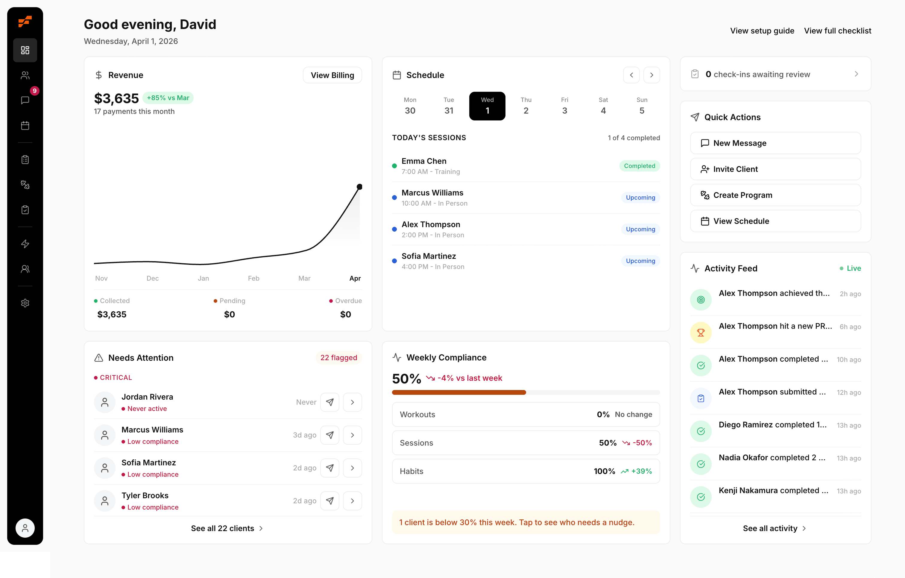
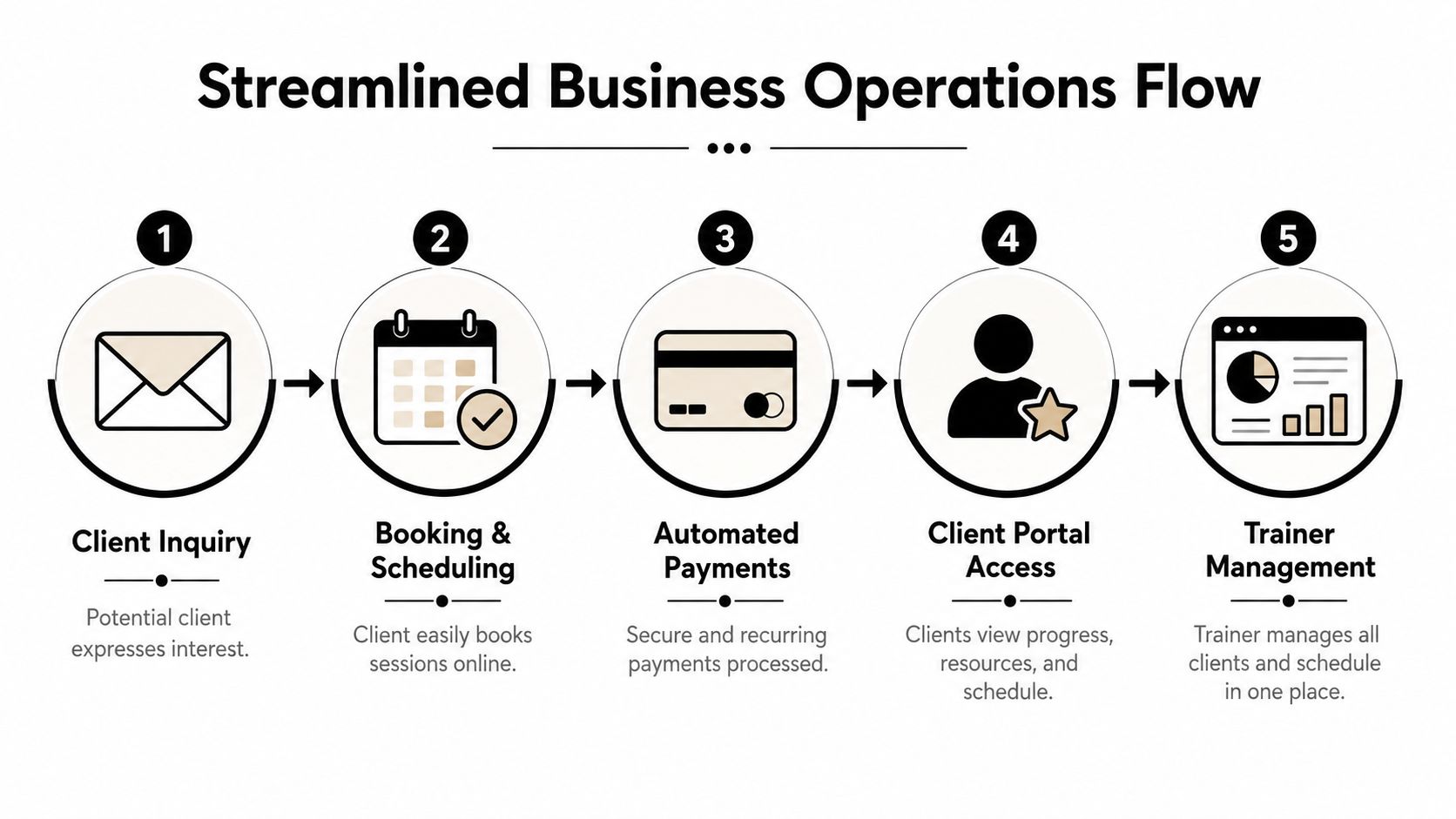
Build the Engine for Booking Payments and Client Portals
A clean homepage won't save a messy backend.
A common failure point for trainer websites is that the front end looks professional, but the actual business still runs on patchwork. Scheduling sits in one app, payments in another, check-ins in text threads, progress photos in a shared album, habits in a notes app, and client history in your head.
That setup doesn't just feel annoying. It creates avoidable mistakes.
Why the duct-tape method fails
At first, disconnected tools can seem cheaper or more flexible. In practice, they cost you attention.
Every separate tool creates another place where something can go wrong:
A prospect books, but doesn't pay
A client pays, but doesn't complete intake
A check-in gets buried in messages
A reschedule isn't reflected everywhere
A progress update never makes it back into programming decisions
When you're coaching 1 to 1, details matter. If your systems make it harder to see those details, they're working against your coaching.
A website for personal trainers should reduce admin after the sale, not dump more admin on top of it.
What the engine actually needs
You don't need fancy features for the sake of it. You need the pieces that keep the client flow tight from inquiry to retention.
Look for these core functions:
Self-serve booking
Clients should see real availability and choose a session or consult without waiting for you to reply.Payments built into the flow
If someone can book without paying when payment is required, you're inviting follow-up work.Client intake before delivery
Goals, injuries, preferences, readiness, and basic history should live in one place you can revisit.A client portal A client portal makes ongoing coaching easier to manage. Progress photos, measurements, check-ins, workout history, reminders, and key messages should not be spread across random tools.
One admin view for you
You should be able to see who's active, who's overdue, who has upcoming sessions, and who needs attention without hunting through tabs.
Why the portal matters after the sale
Retention usually drops when clients stop seeing evidence that the process is working. That's why the client side of the website matters as much as the lead side.
Guidance on retaining personal training clients suggests average client retention sits around 65% to 70%. That's a clear reminder that signing clients is only half the job. The same guidance points out that a stronger website setup can support retention by giving clients a self-serve place for progress photos, measurements, and workout history, so they can see improvement even during plateaus.
That's the difference between a site that markets and a site that supports coaching.
A simple comparison
Setup | What usually happens |
|---|---|
Disconnected tools | More copy-pasting, more reminders, more dropped details |
Integrated workflow | Fewer manual steps, clearer client records, cleaner follow-through |
If you're evaluating what this should look like in practice, this guide to the best personal trainer app options is a useful place to compare what matters day to day.
What works better than patching tools together
The best setup is usually boring. That's a compliment.
You want one system where the public website connects to the actual coaching workflow. A prospect should be able to go from interest to booking to payment to onboarding without you manually stitching the process together. Then current clients should have a familiar place to log in, review what matters, and stay on track.
That doesn't mean every coach needs the most complex stack possible. It means your stack should match the shape of your business.
If you coach online or hybrid, your website should connect directly to:
Scheduling
Payment collection
Client records
Progress tracking
Check-ins and communication
Anything less leaves you acting like a human integration.
Launch Your Site and Get Your First Bookings
Don't treat launch day like a grand opening. Treat it like a systems test.
The smartest first launch is quiet. You want a few real people to move through the full flow before you send broader traffic to it. That means testing the site with the same standards you'd use for a new client block. Clean execution first, then scale.
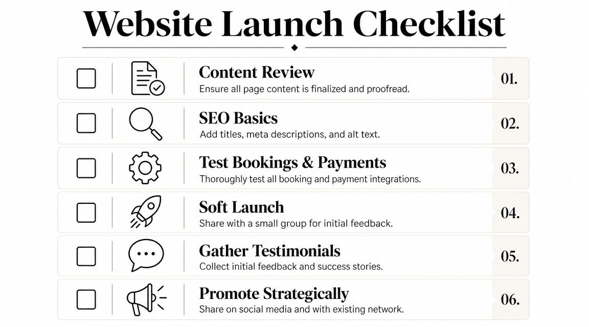
Run a soft launch first
Pick a friend, past client, or trusted current client and have them go through the process exactly as a new lead would.
Ask them to test:
Homepage clarity: can they tell who you help and what to do next?
Offer clarity: do your services make sense without explanation?
Booking flow: can they choose the right option without getting stuck?
Payment step: does it feel smooth and obvious?
Confirmation: do they know what happens next after booking?
Tell them not to be polite. You want them to point out confusing language, missing buttons, weird mobile spacing, and anything that makes the experience feel uncertain.
Announce the upgrade to warm traffic
Your first bookings usually come from people who already know you. Existing followers, former clients, current clients with friends, and email subscribers are the best test audience because they're already trust-warm.
A simple announcement works:
I've updated my website to make booking, onboarding, and client support a lot easier. If you've been thinking about training with me, you can now see the options and get started without the usual back-and-forth.
That message works because it frames the site as an improvement in client experience, not just a self-promotional post.
Check these before you share widely
Use this short pre-launch review:
Check | What to confirm |
|---|---|
Mobile layout | Buttons, text, and forms are easy to use on a phone |
Links | Every CTA goes where it should |
Forms | Submissions arrive where you expect |
Payments | Required payments process correctly |
Thank-you page | The next instruction is obvious |
Once that's clean, send traffic. Don't wait for the site to feel perfect. Wait for it to feel usable and trustworthy.
Your 24-Hour Website Action Plan
If your website is still acting like an online business card, fix the workflow before you touch the design.
You can make real progress on this in one day if you stay focused on the parts that remove friction. Don't start with fonts. Start with the business steps that keep falling back onto you.
Do these four things today
Sketch the client path on paper Write down the route from first visit to paid client. Homepage, service page, proof, booking, payment, onboarding. If you can't draw the path easily, your website won't feel simple to a buyer either.
Write your homepage opener
Use one clear sentence: I help [specific person] achieve [specific result]. Then add the next step directly under it. No slogans, no filler.List the three admin tasks you hate most
Be honest. It's usually chasing payments, rescheduling by text, or digging for client history. Those are the places your site needs to connect to real systems.Review one piece of your current client experience
Open your own site and try to move through it like a stranger. Book, fill out the form, and read the follow-up. If it feels clunky to you, it feels worse to a prospect.
A surprising number of coaches spend more time planning content than fixing workflow. If you want a quick reminder that engagement systems matter too, even simple exercise challenge ideas for clients can show you how much better coaching works when everything has a defined place.
Keep the standard simple
Use this filter for every decision:
Does this help the right client understand my offer faster?
Does this reduce the amount of manual admin I do each week?
Does this make the post-sale client experience easier to manage?
If the answer is no, it probably doesn't belong on your site yet.
Your business runs on systems. Your website should be one of them, not another thing you have to babysit.
If you're done stitching together calendars, payment links, check-ins, and client notes, FitCentral gives personal trainers one reliable place to run the business side of coaching. It was co-founded by David Spitdowski, a practicing personal trainer who uses it with real clients every day, and it's built for coaches who want cleaner booking, payments, progress tracking, and client management without the usual platform headaches.
See also


Ready to stop fighting your software?
FitCentral gives you everything you need to manage clients, deliver results, and grow your business. Sign up today.